Why Proper Apparel Graphics Placement Matters
Graphics placement isn’t just aesthetics—it affects viewer perception, legibility, and overall professionalism. Whether you’re designing t‑shirts, custom hoodie graphics, or polo logos, correct placement ensures your design communicates clearly and fits the garment’s proportions. A poorly placed graphic, no matter how great the artwork is, can look off, unbalanced, or even distort with wear. Visual hierarchy and balance help your design speak without distortion or misalignment.
Key Terms in Apparel Design Placement
To understand where and how to place graphics on custom apparel, you need to know:
Anchor point: the reference point for placing designs (e.g., center of chest).
Print area: the maximum available surface on the garment that will hold the graphics.
Placement zone: specific zones like left chest, center chest, sleeve, upper back.
Design resolution: recommended 300 DPI (dots per inch) for print clarity; low resolution leads to blurry artwork.
Apparel Design Placement - Types and Placement Zones
Garment Type | Placement Name | Image | Description | Standard Position from Seams | Max Print Size (Approx.) |
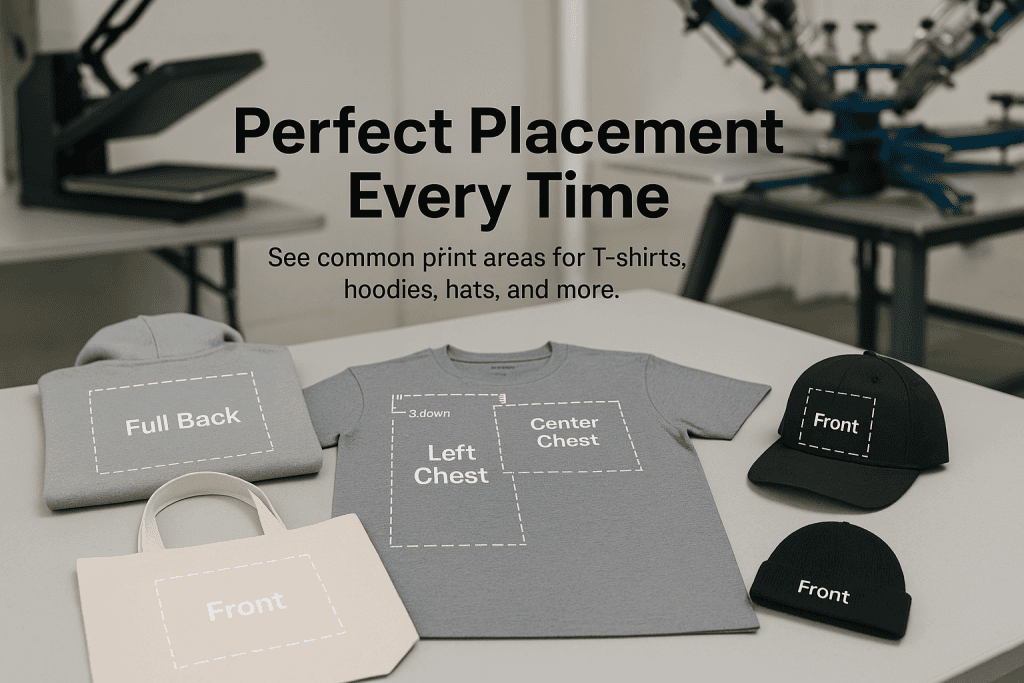
---|---|---|---|---|---|
T-Shirts
| Left Chest | 
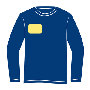
Small logo on left chest | 7″–9″ down from shoulder seam, 4″ from center line | 3.5″ x 3.5″ | |
Center Chest | Main front design | 3″–4″ down from bottom of collar, centered | 9″ x 12″ | ||
Full Front | | 
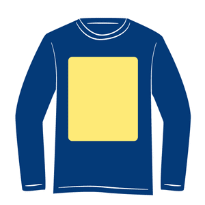
Large graphic covering torso | 2.5″ from collar, centered | 12″ x 14″ | |
Full Back | 
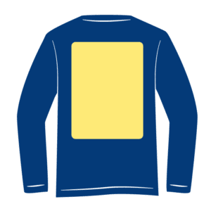
Large graphic on back torso | 3″ from back collar, centered | 12″ x 14″ | ||
Upper Back (Yoke) | Small logo or text below neckline | 1″–1.5″ below back collar | 4″ x 12″ | ||
Sleeve (Short) | 
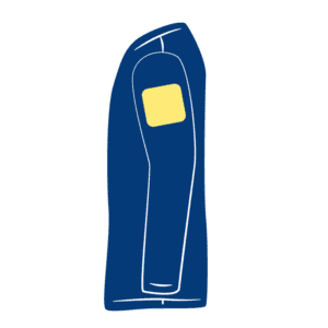
Small logo/text on sleeve (usually left) | Centered between shoulder seam and sleeve hem | 3″ x 3″ | ||
Long Sleeves & Hoodies | Vertical Sleeve Print | 
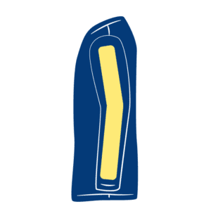
Runs down outer sleeve | Starts ~2″ below shoulder seam, centered vertically | Up to 3.5″ x 14″ | |
Hoodies | Center Chest (Below Hood) | Adjusted down to account for hood drop | 3.5″–5″ from neckline depending on size | 9″ x 10″ | |
Pocket Print | 
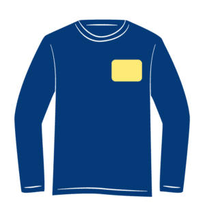
Graphic above or over pouch pocket | 1″–2″ above top of pocket OR centered on it | 6″ x 6″ | ||
Back Print | Graphic on hoodie back | 3″ from back collar, centered | 12″ x 14″ | ||
Tote Bags | Center Front | Main print area between handles and bottom | Centered 3″–4″ below handle seam | 10″ x 10″ | |
Upper Corner | Small graphic near top left/right | 1″–2″ below top hem, 1″–2″ from side seam | 3″ x 3″ | ||
Hats | Front Panel | Embroidery or patch area on front | Centered vertically between brim and crown seam | 2″ x 4.5″ | |
Side Panel | Small design on left or right | Centered vertically, 1″–1.5″ behind front panel seam | 2″ x 2″ |
Shirts Graphics Design Placement
Left Chest / Pocket Logo – standard 3.5″×3.5″ size, placed 7″–9″ down from shoulder seam, centered 4″ from center line.
Center Chest – medium‑size logos or artwork, placed 3″–4″ below collar, size typically 6″×6″ to 9″×12″
Full Front – covers torso; begin 2.5″–3″ below collar, standard sizes about 12″×14″ but can reach 15″×18″ on certain garments
Upper Back (Yoke) – small text or logo 1″–1.5″ below back collar, size around 4″×12″
Full Back – large back prints begin 3″–4″ below collar, centered horizontally, typical 12″×14″.
Hoodies & Sweatshirts Graphics Design Placement
Graphics should be adjusted to accommodate hood drop: center chest placement sits about 3.5″–5″ from neckline depending on size.
Pocket Prints: positioned 1″–2″ above the pouch pocket or centered on it; typical up to 6″×6″.
Back Prints: similar to t‑shirt back; 12″×14″, 3″ below collar, centered.
Sleeve Prints: vertical graphics down sleeves starting about 2″ below the shoulder seam; up to 3.5″×14″.
Polo Shirts and Collared Apparel Graphics Design Placement
Most corporate or team branding uses left chest logos, ~3″–4″ wide, about 3–4″ below shoulder seam.
Full Back graphics and sleeve logos follow similar dimensions adapted for heavier fabric and seams.
Standard Design Sizes & Guidelines
Left Chest & Pocket Graphics
Size: ~3.5″ × 3.5″ for adult; youth scaled down to 2″–3″.
Placement: 7″–9″ from shoulder; 4″ from center line.
Center Chest & Full‑Front Artwork
Center chest: 6″–10″ wide, positioned 3″–4″ below collar.
Full front: can reach 12″–16″ high and 12″–15″ wide; simpler designs avoid bleed or seam overlap.
Upper‑Back & Full‑Back Prints
Upper-back small logos: 1″–1.5″ below collar, size ~4″×12″.
Full-back: start 3″–6″ below collar, balanced width 10″–14″.
Sleeve & Vertical Sleeve Prints
Short sleeve prints: 3″×3″ average, centered between shoulder seam and cuff.
Long sleeve vertical prints: run down sleeve, up to 3.5″ width by 14″ length.
Custom Shirt Design Placement by Size
Scaling for Youth vs Adults
Youth sizes use smaller designs: left chest logos sized 2″–3″ wide, center prints no larger than 6″–8″, full front maximum ~10″ across. Proportion matters for legibility and fit.
Fit Style Differences
Slim-fit shirts may require shifting placement slightly upward to avoid sitting too low when worn. Oversized shirts need artwork moved downward to appear balanced on wider fabric.
Artwork Resolution & Print Prep
Always create artwork at 300 DPI or higher for crisp printing. Use PNGs with transparent backgrounds when possible. Mockups are essential: visual preview tools in POD services (like shop.printhabit.com has) help ensure placement aligns correctly.
Include bleed margins of 0.125″–0.25″ to prevent cutting or misalignment.
Read more about creating print ready artwork >>
Choosing Placement Based on Design Type
Logos & Simple Text: left chest or center chest works best for subtler branding.
Large Illustrations: ideal for full‑front or full‑back placements where detail and scale shine.
Accent Prints (e.g., sleeve stripes or side graphics): sleeve or vertical prints add unique styling without crowding main canvas.
Multi‑placement Design Combinations
Common combos:
Left Chest + Full Back: professional front, statement back.
Left Chest + Sleeve: subtle branding with side detail.
Full Front + Full Back: bold dual‑sided message.
Center Chest + Sleeve: balanced front with edge detail.
Use combinations to amplify branding or design complexity without overcrowding any one zone.
Practical Guidelines for Print Methods
Screen Printing: Best for bold, solid‑color designs. Works well on chest or back zones with simpler color separation.
DTG (Direct‑to‑Garment): Great for gradient artwork and full‑front or full‑back prints, but be mindful of placement height, especially on hoodies.
Embroidery: Left chest and upper‑back logos work well; limit detail in small areas.
DTF (Direct‑to‑Film): Similar to DTG for placement, flexible for high-detail and full‑area graphics.
Common Mistakes & How to Avoid Them
Too low placement – avoid “belly buttons” by keeping chest graphics 3″–4″ below collar.
Misalignment – measure from seams and centerline; eyeballing leads to imbalance.
Low-resolution art – always supply vector or high-DPI files.
Ignoring seams or pockets – account for collars, cuffs, and fabric behavior when placed.
Overcrowding zones – multiple prints need spacing and balance.
Tips from Industry Pros
Designers on Reddit report consistent guidance:
“Line the top of your logo 4 fingers to a hand down from the collar… middle of the shoulder blades” for back placement.
“3 in down in front from collar seam” for front chest placement Reddit.
These practical measures align closely with the 3″–4″ rule makers in professional print guides.
Conclusion
Getting apparel graphics placement right transforms custom apparel from amateur to pro‑level. Whether you’re placing logos on t-shirts, large illustrations on hoodies, or accent prints on sleeves, using the right zone, sizing, and resolution ensures your design looks thoughtful and polished. Use templates, mockups, and rules like the “3‑4 inches from collar” or “7‑9 inches from shoulder seam” consistently. Try combining placements for layered branding and always stay aware of fabric fit and method limitations.
Feel free to adapt these guidelines to different garments, styles, and printing methods. Experiment, refine, and let your custom apparel stand out!
Frequently Asked Questions (FAQ)
What is the best placement for a logo on a t-shirt?
Typically a left-chest logo measures about 3.5″×3.5″, placed 7–9″ below the shoulder seam—perfect for uniforms and branding. Use our size guide above for exact dimensions.
Can I mix chest and sleeve prints in one order?
Yes! You can order multi-placement prints. We’ll break down pricing accordingly—just let us know in your design upload or quote request.
Do print placements differ on hoodies vs t-shirts?
Yes—hoodies sit lower due to the hood. We adjust the print center ~3.5″–5″ below the neckline depending on size
Do placement guidelines change for women’s or kids’ shirts
Yes — on ladies’ or youth shirts, drop placement by about 1 inch to maintain proportions. Larger designs may also need repositioning to look visually centered.
How do I place prints on hoodies differently than T‑shirts?
Hoodies typically require designs placed slightly lower (3.5″–5″ below neckline) to avoid hood interference and account for bleed from the hood drop.
What size should a full‑front t‑shirt graphic be?
Generally 12″×14″, but up to 15″×18″ on specific garments; start 2.5″–3″ below collar for best visual balance.
What file resolution do I need for printing?
Minimum 300 DPI at actual print size; use PNG or vector formats like AI or EPS for best quality. You can read detailed information on print ready artwork in our guide.
Graphics Placement Guide for T-Shirts
Placing graphics on t-shirts is both an art and a science. This graphics placement guide for t-shirts offers exact measurements, standard zones, and design tips to help your custom t-shirt stand out with professional precision.
Whether you’re designing for personal use, launching a fashion brand, or running a print-on-demand shop, accurate graphic placement ensures your artwork looks intentional, balanced, and visually impactful.
Key T-Shirt Placement Zones
Each part of a t-shirt offers unique visual real estate. Here’s a breakdown:
Placement Zone | Recommended Size | Positioning Details |
---|---|---|
Left Chest | 3.5″ × 3.5″ | 7″–9″ down from shoulder seam, 4″ from center line |
Center Chest | 6″ × 6″ to 10″ × 12″ | 3″–4″ below the neckline |
Full Front | Up to 12″ × 16″ | Starts 2.5″–3″ below collar |
Upper Back (Yoke) | 4″ × 12″ | 1″–1.5″ below back collar |
Full Back | 12″ × 14″ to 15″ × 18″ | Begins 3″–4″ below the collar |
Sleeve (Short) | 3″ × 3″ | Centered between shoulder seam and sleeve hem |
Sleeve (Vertical) | Up to 3.5″ × 14″ | Vertical orientation down the sleeve |
How to Use This Guide
Always measure from collar seams or center lines, not visual approximations.
Use mockups and rulers to preview final placement.
Print on actual fabric samples if possible — what looks good digitally may shift when worn.
Popular T-Shirt Design Types and Placement
Minimalist logos – best placed on the left chest.
Bold text-based designs – center or full-front preferred.
Artwork-heavy prints – utilize full-back or full-front zones.
Team names or player IDs – traditionally placed on upper back.
Event or promotional tees – often use multi-zone combos like left chest + full-back.
Common Errors to Avoid
Too low placement – “belly button designs” occur when center graphics drop too far.
Off-center alignments – always center artwork from the actual collar seam, not the graphic preview box.
Incorrect sizing – never stretch artwork to fill a space unnaturally.